The thirteen is facing the wrong way.
On the Bravur Grand Tour IV, just before the three o’clock marker, the number sits upside down inside a tiny pink panel. It is not a printing mistake. Bravur is referring to a cycling superstition: some riders pin the supposedly unlucky race number on upside down.
There is something curious about putting a detail with no connection to precision on a precision instrument. Neither the spring nor the gears knows that thirteen is meant to be unlucky. Yet this small irregularity is where the watch starts to become interesting.
Swedish brand Bravur does not need a mechanical chronograph to make you a better cyclist. Its more interesting proposition is how much a sport contains beyond the result. Jerseys, colours, small habits. Things a stopwatch cannot measure, but a dial can tell you about.
Before the peloton arrived
Bravur began in 2011 as the venture of two Swedish industrial designers. Its 2013 launch announcement spoke primarily about aesthetics, urban life and recognisable objects. The founders had been looking for watches for themselves, but struggled to identify with the way existing brands presented their products. They wanted something more personal than sports cars, aircraft and demonstrations of power.
That matters because it is tempting to read today’s cycling-focused Bravur backwards as a sports brand from the outset. The original question was broader: how do you recognise a watch when you cover up its name?
The Scandinavia represents this quieter side well. A curved dial, an inner minute track and a date at six o’clock, with a Sellita SW300-1 inside a 39mm case. What makes the composition interesting is not the movement designation, but the relationship between its edge and its centre. The markings do not flatten into a single plane. Your eye has somewhere else to go.
Restraint on a watch like this does not necessarily mean an absence of detail. It means the details are not all asking for attention at once. A distinctive minute ring or a well-judged hand shape can establish character with less noise than another line of lettering.
Two cyclists, one workshop
For Magnus and Johan, cycling was not a source of inspiration discovered after they started looking for a marketing angle. Their current account describes them as rivals in the 1990s, with a friendship and a shared enthusiasm for the sport that have endured. Alongside their industrial-design backgrounds, they had a common store of visual memories.
Today’s watches are built to order in small quantities at the workshop in Båstad, southern Sweden. Assembly and testing take place there; the movements come from Switzerland. Swedish design and workshop work do not mean a proprietary Swedish calibre.
That distinction need not diminish the brand. It describes a different kind of work. A watch company can choose to find its voice in the relationship between case, dial and practical details rather than in a new escapement. The resulting object can still be distinctive. You simply need to look for that distinction somewhere other than an in-house movement.
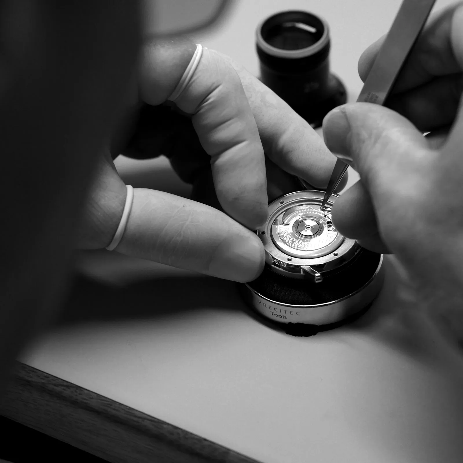 Workshop work in Bravur’s own photograph. This illustrates assembly, not the specific movement of the Grand Tour IV. Photograph: Bravur.
Pink is not merely decoration
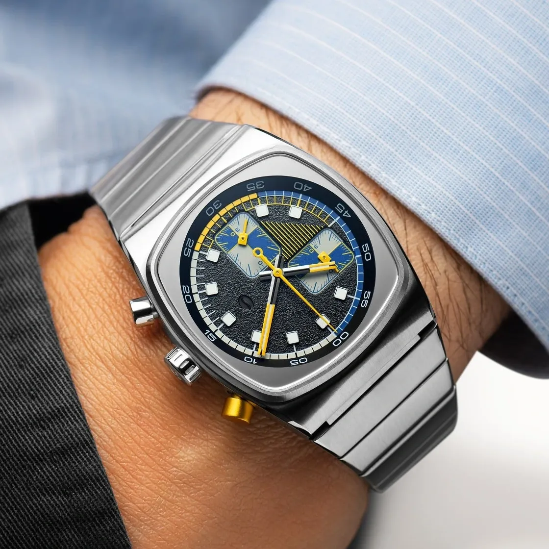
In the Grand Tour collection, cycling becomes an organising principle rather than a backstory. Three pink subdials sit on the steel-grey and black face of the Grand Tour IV. The rough outer texture suggests tarmac; the recessed circles look smoother and more separate.
The pink does not require an invented mood board. The leader of the Giro d’Italia’s general classification has worn a pink jersey since 1931. Its colour came from the paper used by La Gazzetta dello Sport, the newspaper behind the race. A printing choice became a sporting symbol, then a visual shorthand that no longer needed the race’s full name beside it.
On the watch, colour carries a story while separating functions. The three light circles establish themselves immediately against the dark ground. The dial remains worth looking at even if its owner has never followed the Italian race. For someone who has, the same pink carries an additional meaning.
That is the difference between an applied emblem and a theme developed through the object. You can take an emblem away and leave essentially the same watch underneath. Remove the colours and surface treatment here, and you would have to reconsider the composition itself.
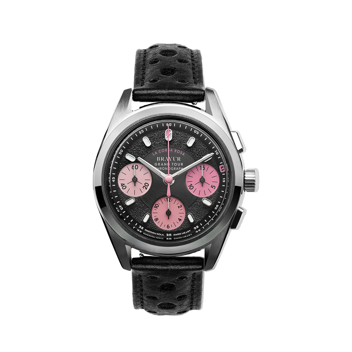 Grand Tour IV in the La Corsa Rosa colour scheme. Original manufacturer product image: Bravur. Background and cast shadow removed by Lume; the dial has not been redrawn.
What do the three small circles measure?
Not every seconds hand on a chronograph does the same job. The Grand Tour’s long central hand belongs to the stopwatch. When no interval is being timed, it can remain at zero while the watch itself runs normally. Continuous seconds appear on the small dial at nine o’clock.
The right-hand counter completes a revolution in fifteen minutes; the lower one counts twelve hours. The upper pusher starts and stops the measurement. The lower one resets it once stopped. The manufacturer’s manual sets out these roles separately.
A fifteen-minute scale is a thoughtful choice for shorter intervals. On a circle of the same size, each minute has more room than it would on a thirty-minute counter. A ten-minute effort does not occupy the same narrow slice. This does not make the measurement more accurate, but it changes how it can be read.
None of that makes the Grand Tour a training computer. Its hands cannot see your power output, remember last week’s ride or draw a route. They show the time between a start and a stop. Choosing to use them means choosing a bounded, manually initiated action, not a system for collecting data.
A small diameter is not a slim watch
The Grand Tour measures 38.2mm across and 46.3mm from lug tip to lug tip. Those numbers make it easy to imagine a restrained, almost dressy chronograph. But the third dimension in the manufacturer’s drawing is a thickness of 14.4mm.
This is not a thin watch.
Diameter describes the circle seen from above. Thickness describes how far the object rises from the wrist. It is worth resisting the temptation to merge both into the word “compact”. Under a shirt cuff or beside the edge of a glove, height can matter just as much as whether the case overhangs sideways.
The SW511b automatic chronograph movement sits beneath a domed sapphire crystal. Bravur specifies a power reserve of up to 62 hours. Before buying, however, a side view and a fitting would be more useful than the numbers alone. The junction of strap and case, weight distribution and crown position cannot be contained in a single diameter measurement.
This article is based on sources and visual analysis, not a hands-on test. We therefore do not rate its comfort as though we had spent days wearing it.
The small mistake that is not a mistake
Up close, the inverted thirteen draws the eye again. The other markings help you read the dial. This one briefly interrupts that process: it asks you to look for meaning rather than the time.
A detail like this only works when it does not have to sell the watch by itself. If the case proportions, hands or dial contrasts fail to cohere, an insider’s reference can easily become a novelty. Here, its interest lies in remaining small. You see the pink circles first, the rough edge of the dial a little later, perhaps the inverted number only on a third look.
That sequence matters. Not everything arrives at first glance. The object has something left after a quick inspection, without requiring an explanatory panel beside it.
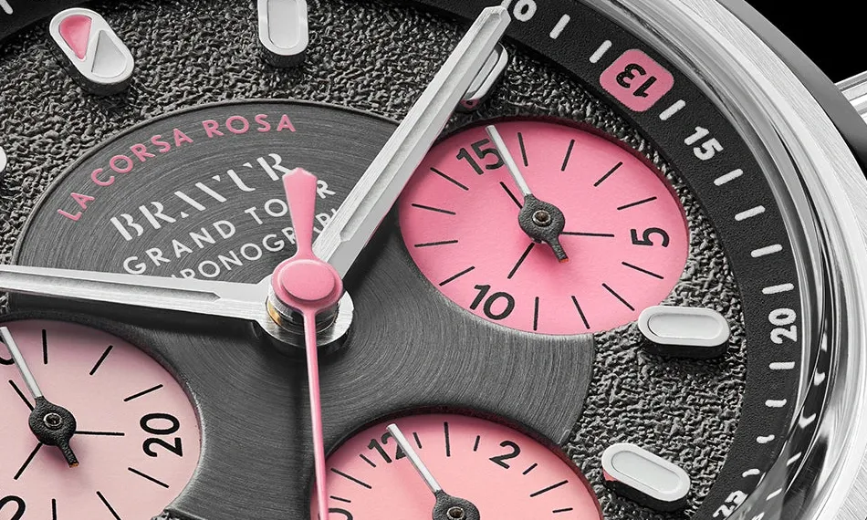 The inverted 13 and fifteen-minute counter. Photograph: Bravur; a dial-only crop of the original manufacturer macro.
What remains when you remove the stopwatch?
The Team Heritage collection asks a different question. Can the cycling character survive without three subdials, two pushers and a timing complication? The series draws on the colours and patterns of team jerseys from the 1950s through the 1980s.
The PEU recalls Peugeot’s black-and-white checks. It is a three-hand, no-date watch with a 37mm case and a Sellita SW200 automatic movement. Fine green outlines pick out the black hour markers, while a quieter checked texture repeats the pattern at the centre.
This version makes it easier to assess the underlying design idea. There is no chronograph to lend the dial an immediate sense of complexity. Rhythm has to emerge from simpler elements: a dark marker, an empty space, then another dark marker. The smaller checks at the centre and the larger hour blocks express the same idea at different scales.
In that respect, the PEU strikes me as the clearer design statement. The Grand Tour can also rely on the density of its functions; this dial has to become recognisable with fewer tools. That is a reading of its form, not a verdict on the relative quality of the two watches’ finishing.
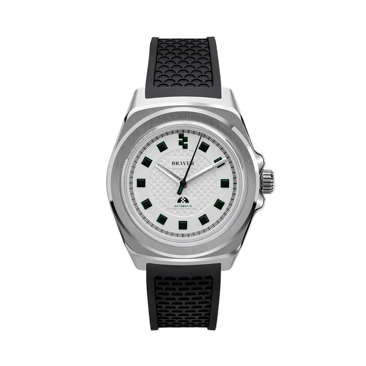 Team Heritage PEU. Original manufacturer product image: Bravur. Background and cast shadow removed by Lume; the original watch pixels are retained.
Not the cheapest route to a Sellita
In the official US-dollar listings checked on 4 October 2026, the Grand Tour IV started at $2,550 and the Team Heritage PEU was listed at $1,195. These are reference points rather than a universal delivered price: the selected version, market and checkout conditions need to be checked before ordering.
Approaching Bravur solely by asking where to find the same movement for less money misses part of the point. It is a legitimate buying question, but it cannot explain why this brand exists. The opposite extreme would be equally unhelpful: treating a personal story as automatic evidence of superior quality.
Paying for design is not irrational. It helps, however, to recognise that this is what you are buying. Cycling references do not add a new measuring capability to the mechanism, and a small workshop does not by itself prove better finishing than a larger manufacturer. A substantial part of Bravur’s proposition is the consistent development of a particular visual world.
Everyday ownership should not be romanticised either. The manufacturer’s instructions explicitly warn that daily wear may not wind the mainspring fully. The nominal reserve is therefore not a promise to take for granted every weekend. A mechanical watch remains an object that needs attention and maintenance, even when there is a race taking place on its dial.
The road stays with it
A thoughtfully themed watch does not demand membership of its subject’s club. For one person, the Grand Tour may simply offer well-judged pink against a dark dial. For another, it may call up an entire sport. Those responses can coexist.
Bravur becomes most interesting to me where it avoids illustrating a bicycle literally. It does not put a wheel on the end of a hand. Instead, it borrows something from the sport’s visual order and tries to make it work as a watch. A jersey becomes a dial, a finish line becomes rhythm, a superstition becomes a small departure from the pattern.
The thirteen remains upside down.
The watch keeps running just the same. There is simply a reason to keep looking after you have read the time.