Few watches make an improbable story seem as plausible as the Cartier Crash. One side stretches while the other pulls inward, and the Roman numerals appear to be negotiating for space inside the irregular case. Tell someone that this watch was once exposed to intense heat, and the first glance does little to discourage the idea.
The familiar origin story takes exactly that approach. A Cartier Baignoire, more specifically an elongated Maxi Oval, is supposedly damaged and partly melted in a burning car. It reaches the London workshop, where the makers recognise the possibilities of its distorted shape. With a name like Crash, the explanation almost writes itself.
But the history of a design cannot be established simply by asking what the finished object resembles. The firm starting point here is not a wrecked car. It is London in 1967.
What do we know about the accident story?
The details change between tellings, but the central idea is consistent: an accident produced a shape that a designer would never have dared to invent. It works well as an origin myth because it explains the name, the silhouette and the watch’s strangeness in a single incident.
The melted watch should not, however, be treated as an established historical object. Francesca Cartier Brickell’s family research and the recollections of her grandfather, Jean-Jacques Cartier, describe a deliberate design process. The head of Cartier London worked with designer Rupert Emmerson to rethink the elongated oval watch. The appearance of crash damage belonged to their design idea; a physically damaged prototype is not established by that account.
This does not make the result less unusual. It restores to the designers something the legend attributes to chance. Someone had to choose where the outline should turn, how far the case could stretch, and when an unexpected shape would become merely awkward.
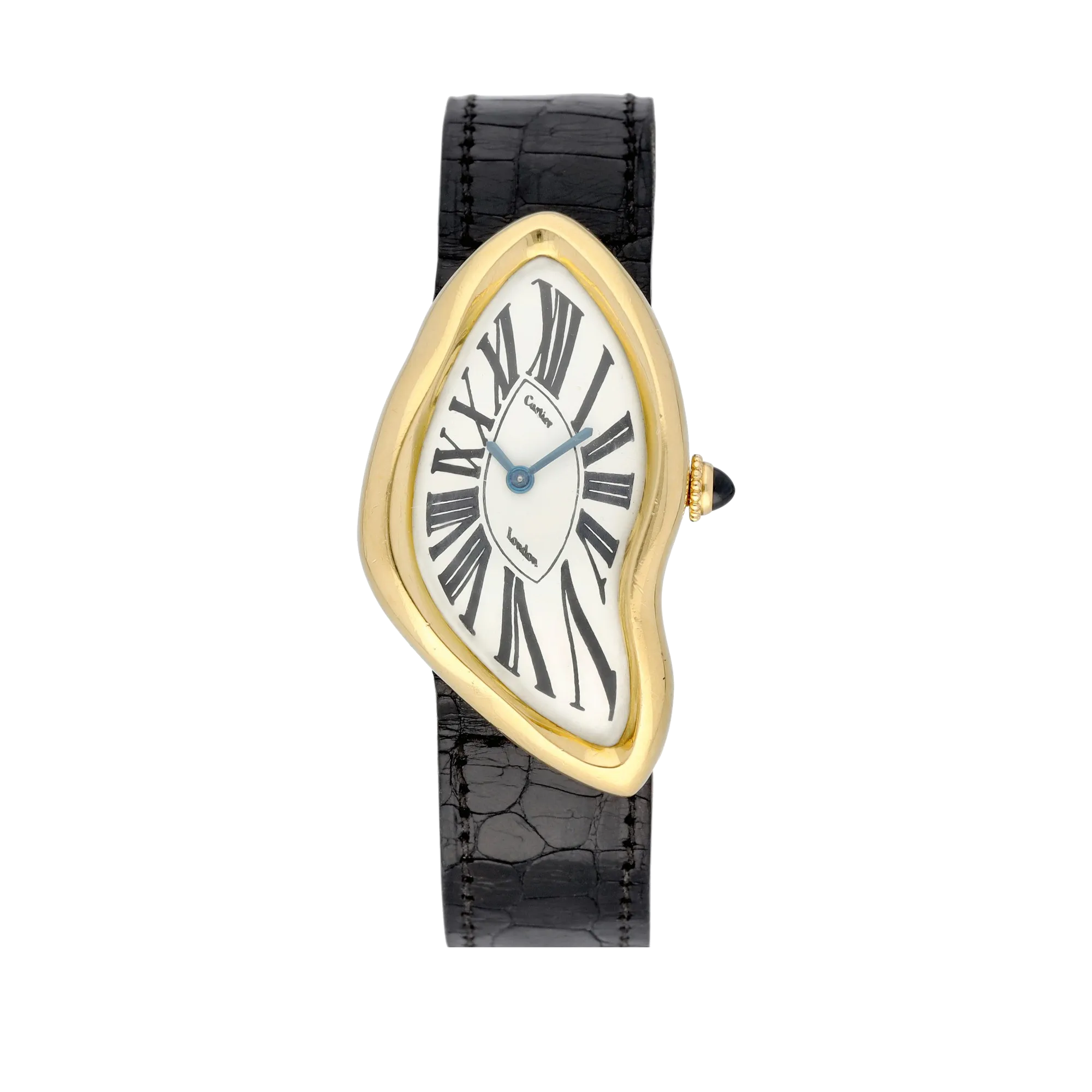
A London Crash made in 1970, still signed London on its dial. This is an early example, not the first watch from 1967. Photograph: Sotheby’s, Geneva 2021, lot 19. Background removed while retaining the original watch pixels.
A city in which it made sense
In 1960s London, dressing well increasingly stopped meaning dressing like one’s parents. The V&A’s history of the decade describes boutiques, Mary Quant and Mod style as different expressions of a generation seeking an identity of its own. Carnaby Street and the King’s Road became conspicuous settings for that change.
Cartier was not, of course, a youth-fashion boutique selling inexpensive clothes. Its New Bond Street world should not be casually merged with the street outside. The difference is precisely what makes the Crash interesting: a traditional jewellery house made an object that shared the period’s freedom with form, without abandoning exacting craftsmanship.
We do not have to describe the dial as a psychedelic poster to recognise an affinity. Loosening rigid conventions, altering familiar proportions and cultivating individuality were recurring concerns across the decade’s visual culture. The Crash did this without a riot of colour. It committed to one transformation and followed it through.
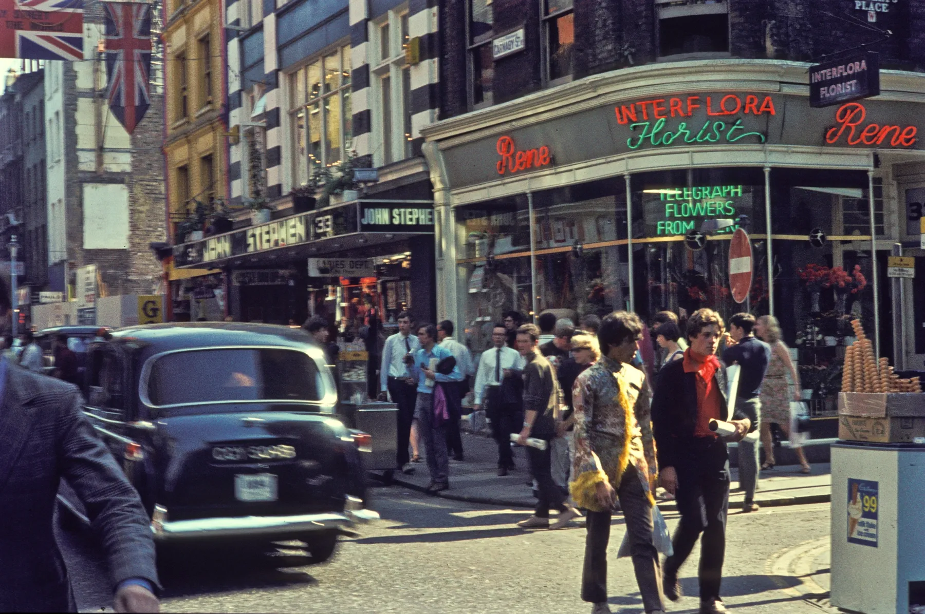
Carnaby Street in 1968, a year after the Crash’s introduction. This is the wider London setting, not Cartier’s premises. Photograph: H. Grobe / Wikimedia Commons, CC BY 3.0. Proportionally resized.
Jean-Jacques Cartier and Rupert Emmerson
As head of the London house, Jean-Jacques Cartier was not selecting a finished watch from a catalogue. He and Emmerson developed the idea together. A design of this kind needs more than someone willing to draw it: it also needs someone prepared to have it made into a working object that customers can actually buy.
The family account includes a proposal with a cracked-looking dial, which was rejected. That detail helps explain the distinction. They were not trying to reproduce a damaged possession faithfully. They were looking for beauty within a distortion. The finished watch does not need painted cracks to make its departure from convention apparent.
Meanwhile, much of its visual vocabulary remains reassuringly traditional: a precious-metal case, a pale dial, Roman numerals, blue hands and a gem-set crown. Taken separately, these are hardly the ingredients of a rebellious fashion accessory. The invention lies in the relationships between familiar elements.
The numerals still had to tell the time
Making the London watch involved the Wright & Davies workshop and head watchmaker Eric Denton, with Jaeger-LeCoultre consulted about a suitable movement. The irregular gold case was difficult to produce, while the dial required repeated revisions.
On a round dial, it is easy to take the underlying arrangement for granted. The hands rotate around a common centre and the hours follow a regular sequence of directions. On the Crash, the numerals also have to negotiate an irregular border. Some are elongated, others narrowed or tilted, yet together they must remain readable as a watch.
This does not mean crumpling the gear train, or making an hour last longer where the case happens to be wider. The problem is one of display. The outline can change, but the meaning of a hand position must survive. That makes the Crash more demanding than an unusual gold shell around an ordinary dial.
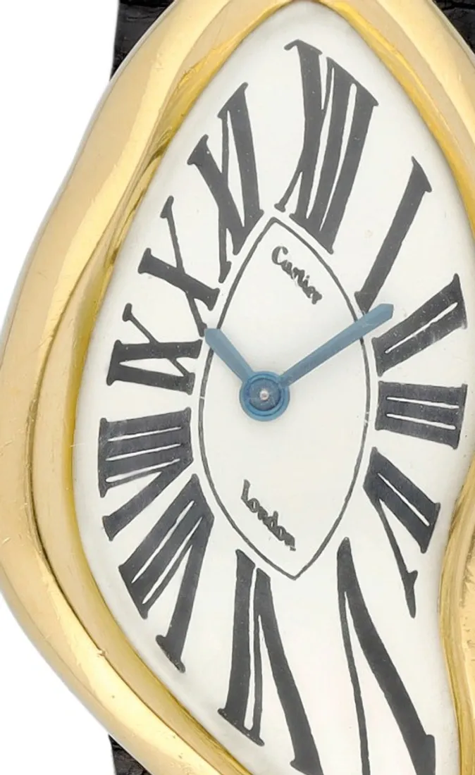
The dial of the 1970 example. Its outer contour and internal display do not follow the same geometry. Photograph: Sotheby’s; macro crop from the original image.
Where does Salvador Dalí fit?
The comparison is understandable. In Dalí’s 1931 painting The Persistence of Memory, pocket watches lose their familiar rigidity. The Crash also unsettles something we normally expect to be solid and orderly. Place the painting and the watch beside one another and a visual conversation readily begins.
It does not follow that Emmerson designed the watch from that painting. The sources reviewed do not establish a direct creative link. A Surrealist affinity is a reasonable interpretation; a proven account of its origin is a different claim.
There is also a useful distinction. Dalí’s soft watches undermine the reassuring solidity of an everyday instrument. Cartier had to make an instrument that remained wearable and legible despite its extraordinary appearance. The resemblance does not make their purposes identical.
From London to Paris
The Crash did not remain a single London experiment. In 1991, Cartier Paris introduced a numbered series of 400 yellow-gold watches, changing the proportions of the earlier London design. The auction record for the Paris example pictured here specifies the manually wound calibre 160. A city name on the dial therefore helps identify a chapter of the watch’s history rather than merely supplying atmosphere.
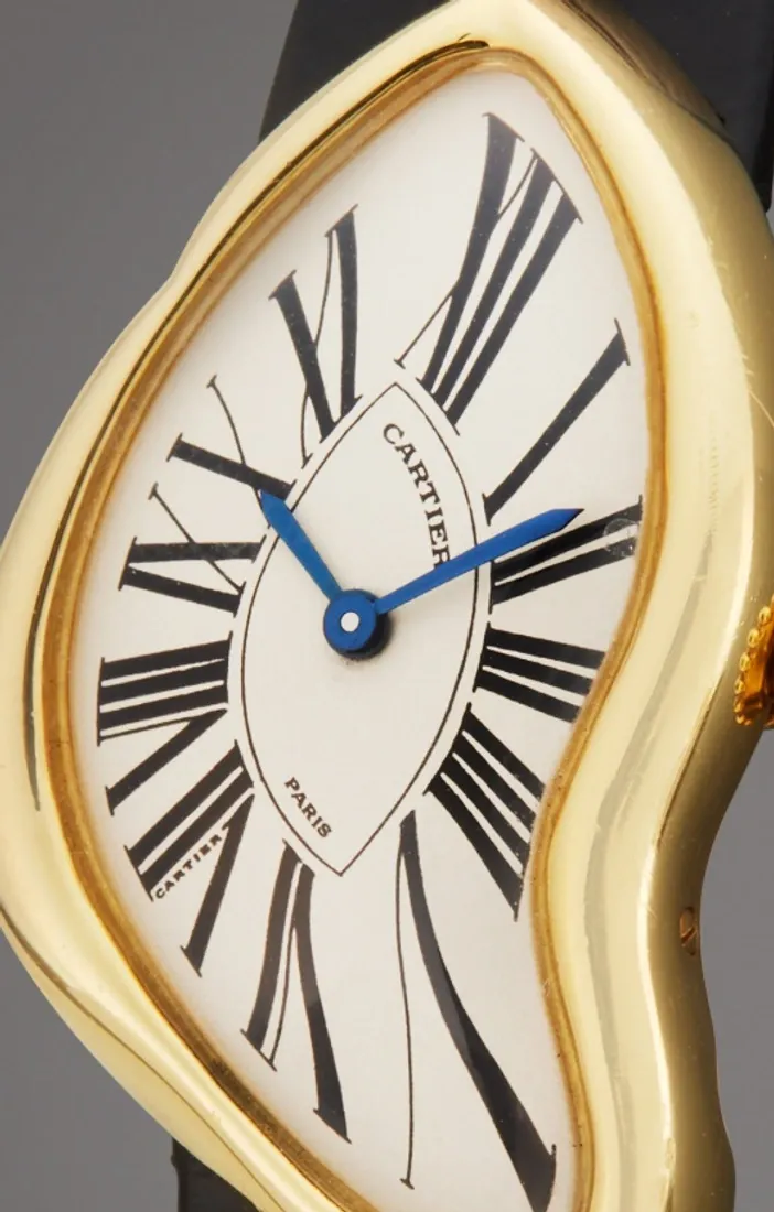
A detail of the circa-1991 Paris example. Notice the Paris signature and the different dial proportions. Photograph: Sotheby’s, Important Watches 2022, lot 56; cropped.
Among the later interpretations, the Skeleton introduced in 2015 marks a particularly important step. Roman numerals no longer sit only on a dial: openworked movement bridges help form them. The subsequent pink-gold reference WHCH0006, for instance, uses the manually wound 9618 MC. This is a different proposition from fitting a conventional movement inside an unconventional case.
The 2026 Crash Skeleton: the shape reaches the movement
Made for the tenth edition of Cartier Privé, the new Crash Skeleton, WHCH0012, develops that idea further. Its platinum case contains the new, manually wound 1967 MC. The calibre number refers to the original watch’s introduction, not to a stock of movements left over from the 1960s.
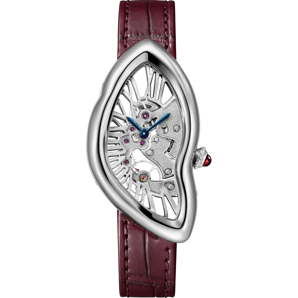
Crash Skeleton, 2026, ref. WHCH0012. Platinum, manually wound 1967 MC, 150 numbered watches. Photograph: Cartier. Background removed from the original manufacturer image.
Cartier specifies a case measuring 45.34 × 25.18 mm, approximately 38 hours of power reserve and an edition of 150 numbered watches. The bridges are hand-hammered; through the openings, the mechanism and the Roman-numeral framework can be seen together. A ruby crown cabochon accompanies the burgundy strap.
This shows how far the initial idea can be developed. On the early Crash, the makers had to establish order within an irregular frame. In the new Skeleton, the visible mechanism becomes part of that frame. The components have not melted: they belong to an arrangement in which asymmetry was a condition of the design from the start.
What remains without the legend?
For me, the Crash’s most compelling feature is not an individual stretched numeral, but the discipline behind the strange appearance. The crown is not debris from an imagined catastrophe. The indentation is not accidental, and the numbers have not drifted into place. Every decision has to work with the others.
That helps explain how a design experiment can become an enduring object. At first it appears unfamiliar; with time, we notice more of the order within it. The accident story is easy to remember. The more interesting story is that people chose to make this watch, and then worked carefully enough to make the choice convincing.