An espresso starts to become interesting after about twenty-five seconds. Around thirty, it is usually ready. Beyond thirty-five, the barista will normally stop the water.
Ten seconds. That is the interval Jonathan Ferrer marked on one of his chronograph scales in turquoise and yellow. The watch does not make coffee, measure water temperature or know how many grams went into the portafilter. It simply shows the short stretch when the cup deserves attention.
Brew was built around those ten seconds.
It would be easy to reduce the brand to a neat sentence. A coffee-loving designer makes coffee watches. The story is more interesting because it did not work that cleanly at first. The original Brew tried to compress the atmosphere of a cafe into steel and rose-gold colour. A practical connection arrived three years later. By the time the Metric appeared, many people wanted one for reasons that had little to do with coffee.
A kitchen timer in New York
Jonathan Ferrer graduated in industrial design from the New Jersey Institute of Technology in 2014. Watches were not entirely foreign territory. His father designed jewellery for Tiffany, his grandfather worked for Cartier, and Ferrer himself interned at Movado. He later designed licensed and white-label watches for names including Crayola, Coleman and Jessica Simpson.
He learned how to turn a sketch into an object a factory could actually make. His own name, however, did not appear on the dials.
In 2015, Ferrer was working in a New York cafe when he noticed a barista timing espresso with a basic kitchen timer. He did not spot a missing grand complication. He saw that an ordinary action could have a better object. The cafe was also a workplace and a refuge. It was somewhere to sit, draw, watch people and, for a few minutes, stop rushing.
That is where the Brew name and the idea of the coffee break came from. The caffeine was not the point. The pause was.
The first watch could only suggest coffee
The first collection, the Special Blend, reached Kickstarter on March 10, 2015. The campaign asked for $35,000. Over forty-five days, 142 backers pledged $39,837.
It was a success, but not the kind of explosion that creates a finished company overnight. Ferrer handled orders from his New York apartment, with his mother helping to pack the watches. The first production run meant learning every part of the business at close range, from manufacturing to customer service.
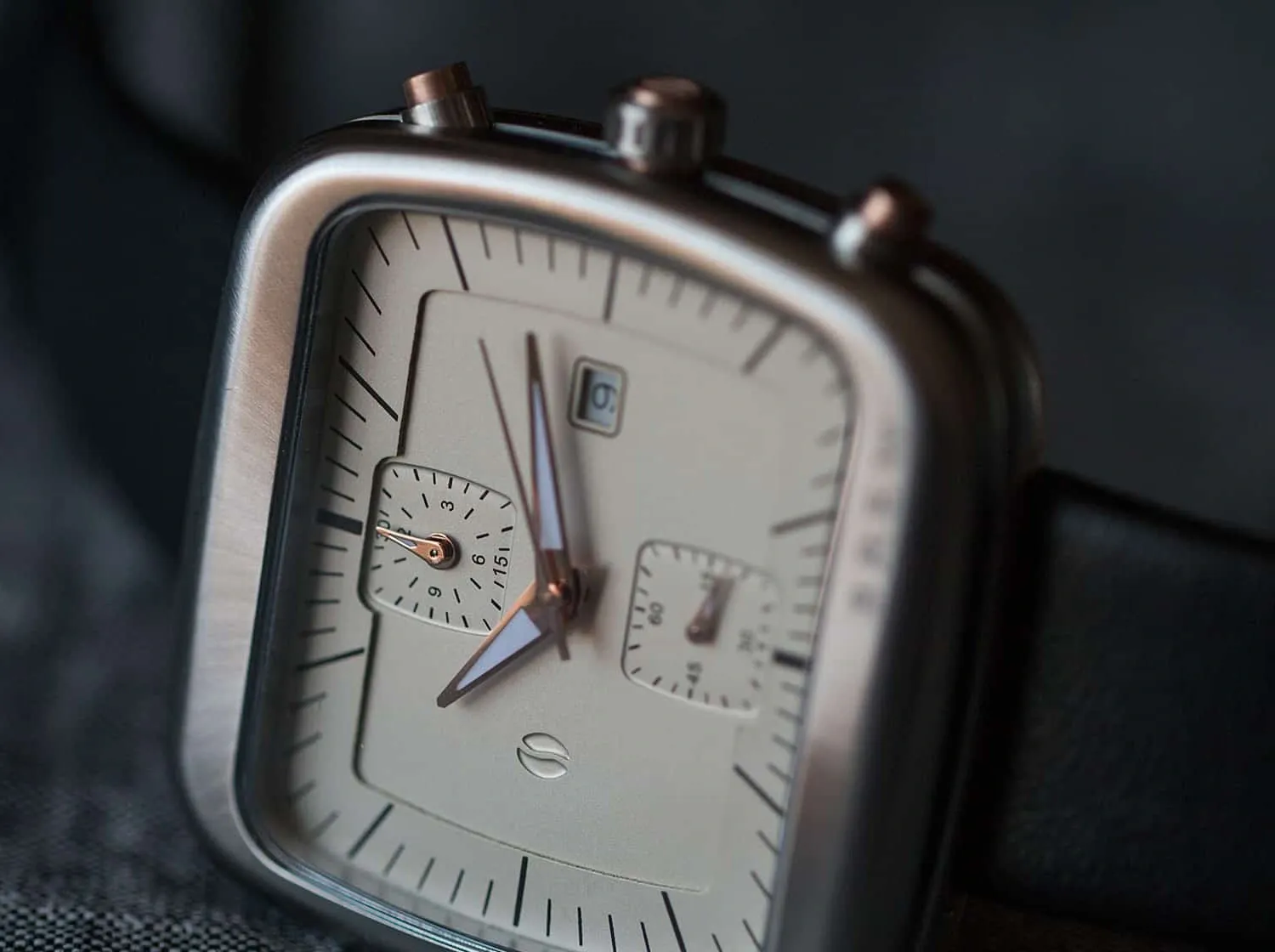 A close view of the original 44mm Special Blend dial. Photo: Worn & Wound.
The Special Blend used a heavily rounded, square case measuring 44mm across. Its hidden lugs made it wear smaller than the number suggested, though it remains a large object by current standards. Grooves along the crown and case sides echoed the vents on commercial espresso machines. Cream, black, brushed steel and copper-like tones came from the warm interior of a cafe.
Inside was a Ronda 3520.D quartz chronograph movement, covered by an unusually shaped sapphire crystal. The Kickstarter price was $275.
The idea was visible, but it needed an explanation. Anyone who skipped the campaign text saw a friendly and unusual square watch. It was not obvious why the name was Brew, or what the object could do beside a cup of coffee. The vents and brown tones created a mood, not a function.
That distinction would become decisive.
The Retrograph found the missing ten seconds
The Retrograph arrived in 2018. Ferrer kept the rounded square but made it smaller and tighter. Its case measured 38mm wide and 41.5mm long. Two subdials, a date at six and slim markers pulled the design toward the instruments of the 1970s.
The important detail was not the case. Between twenty-five and thirty-five seconds, a contrasting section appeared on the outer timing scale.
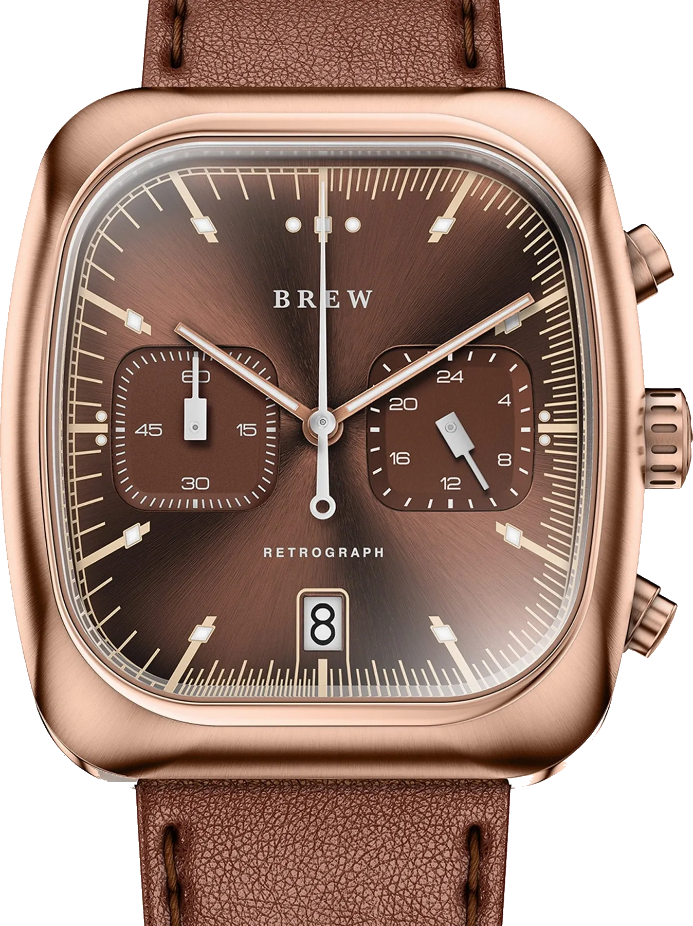 The Retrograph Espresso. The interval from 25 to 35 seconds is marked around the edge of the dial. Original manufacturer photograph with the background removed: Brew Watch Co..
Time is only one of many variables in an espresso. Grind, dose, tamping, water and machine all matter. The coloured section therefore cannot promise a perfect cup. It can show, at a glance, when the extraction is inside a commonly used window.
Here Ferrer found a way to hide the story inside a useful watch without turning it into a costume prop. There is no cup on the dial and no steaming logo. Without the explanation, the coloured interval is a graphic detail. With it, the same marks become a working tool.
The current Retrograph Espresso costs $375. It has a sapphire crystal, 50 metres of water resistance and a hybrid meca-quartz chronograph. Beyond the coffee interval, it can measure up to sixty minutes, so it works just as well for parking, cooking or anything else that still calls for a stopwatch.
Espresso did not make the watch better. Giving the coffee story a real job did.
The square that became a signature
Brew’s first watch was square, but its design language came together in the Retrograph. Ferrer deliberately reached for the cushion cases of around 1970. A square is harder to sell in a market full of round watches, but it is also recognisable from across a room.
That matters for a microbrand. A movement can be ordered from a catalogue, a factory can machine a case, and anyone can select a colour. Finding your own proportions is harder. They must remain familiar five years later without making the watch look like a cheaper version of something famous.
Brew did not sever its ties to historical references. TV-shaped cases, integrated bracelets, bright signal colours and dashboard typography are all familiar. Ferrer’s achievement lies in the way they are assembled. A Brew often looks vintage, yet it is difficult to name the single old watch it copies.
In 2021, that language produced the Metric.
The Metric works without coffee
The Metric is 36mm wide, 41.5mm long and 10.75mm thick. Its bracelet flows directly from the case, while a flat, television-shaped frame surrounds the round dial. The subdials do not mirror one another. One sits at ten, the other at six, and the date slips between four and five.
On paper, it should fall apart. The black dial combines turquoise, orange, yellow, white and green. The hands are not all alike, the subdials differ in size, and the date occupies a position many enthusiasts would rather avoid.
Yet it works.
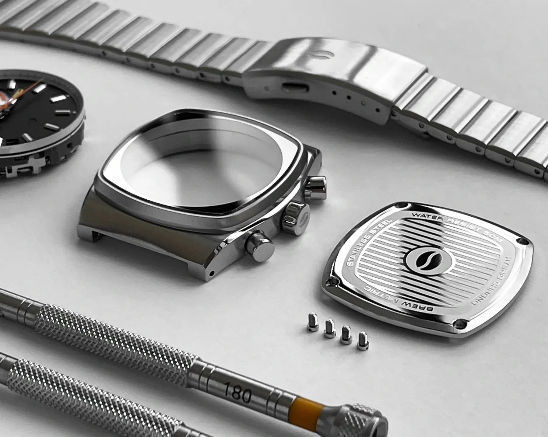 The Metric case, caseback, bracelet and dial assembly before they come together. Photo: Brew Watch Co..
It works because the irregularity feels deliberate. The case is calm and the dial is busy. Brushed surfaces feel industrial, while the colours remain playful. Brew’s logo is barely visible at three, so the name does not fight the scales.
The 25 to 35 second interval remains. The Metric, however, is recognisable even if its owner has never made an espresso. This is the point where a background story became a design language.
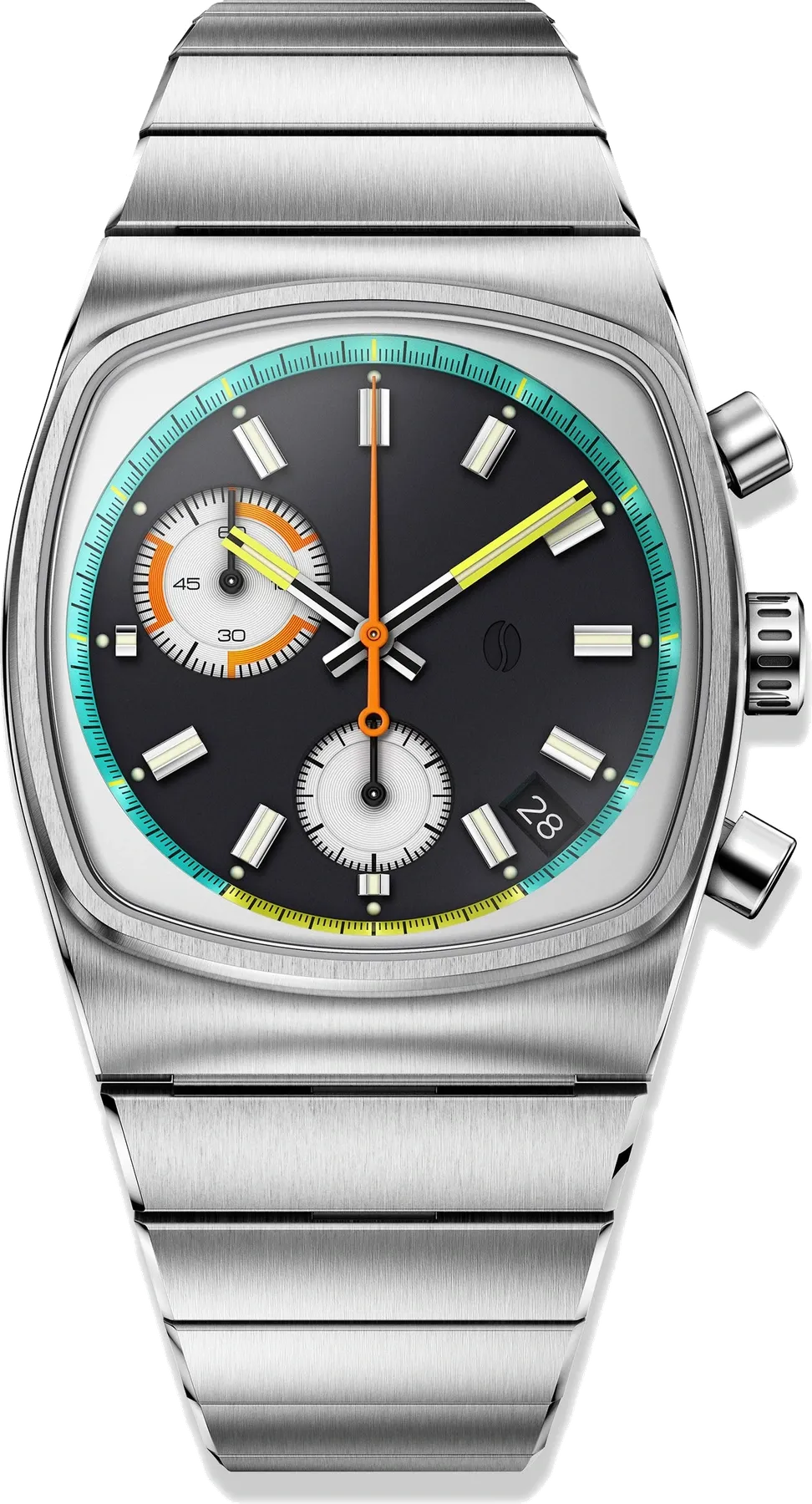 The current Metric Retro in its 36mm case. Original manufacturer photograph with the background removed: Brew Watch Co..
Why there is a battery inside
Some watch enthusiasts lose interest at the word quartz. The Seiko VK68 inside the Metric is not merely a cheap substitute for a mechanical calibre. Quartz regulates normal timekeeping, while a mechanical module controls the starting, stopping and resetting of the chronograph.
The central chronograph hand therefore does not jump once per second. It advances in finer steps, and the pusher responds with a definite click. When reset, the hand snaps directly back to twelve instead of travelling around the dial.
The solution can be more accurate and thinner than a fully mechanical chronograph. It costs less and is easier to service. In return, the running seconds tick on a small subdial and there is no gear-filled spectacle behind the caseback.
For Brew, that is an honest exchange. The brand’s main achievement is not an in-house calibre. It is the case and dial. A thicker watch costing several times as much would lose exactly what makes the Metric appealing. The current $475 price is no longer pocket change, but it remains far below the territory of mechanical chronographs.
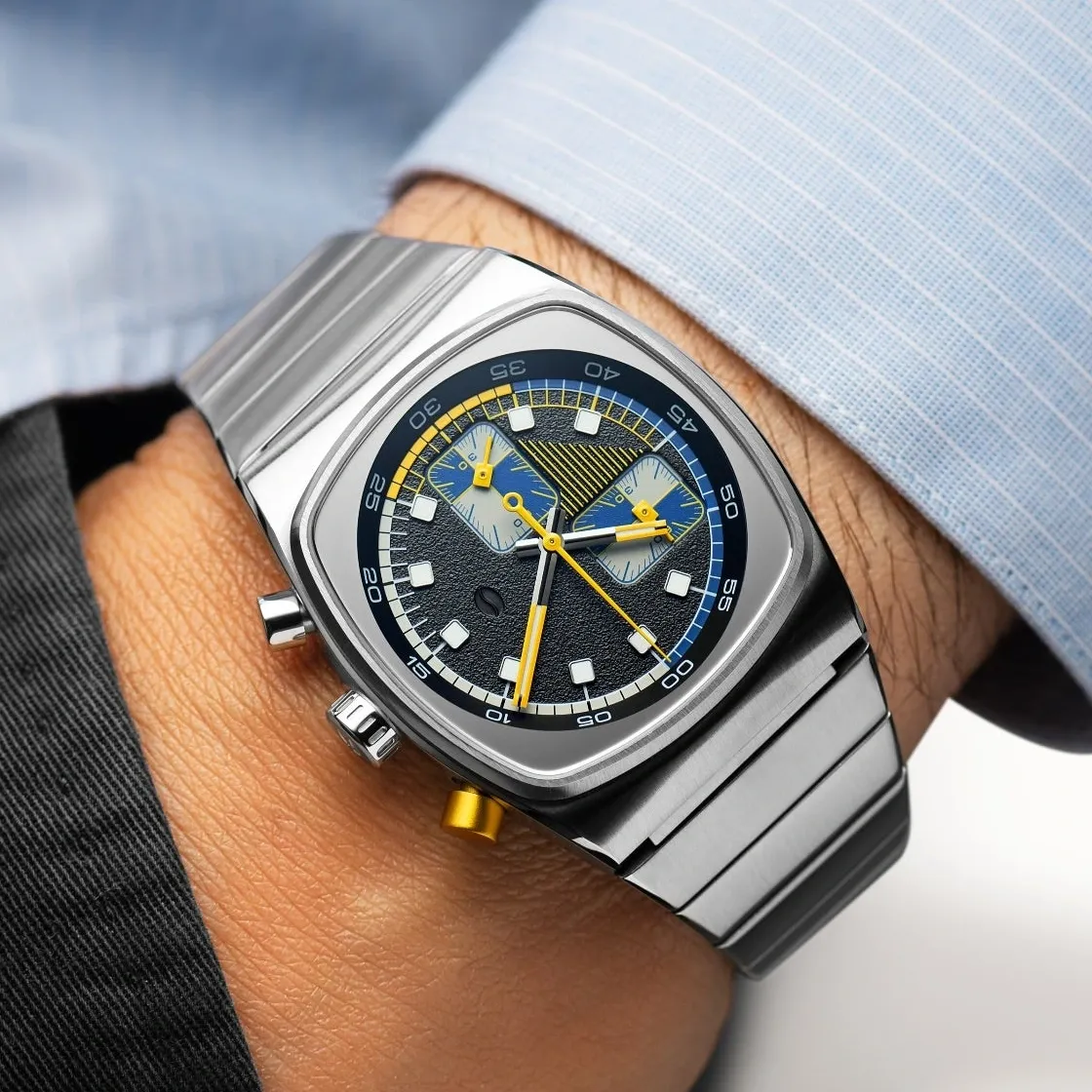 The 36mm Metric on the wrist. Photo: Brew Watch Co..
Where the story ends and the watch remains
A good origin story is dangerous. It can make an object sound better than it is.
The Metric is not flawless. Its dial can feel busy, especially for someone who wants to read every chronograph indication instantly. The date between four and five interrupts the order. Independent reviewers have found slight inconsistency in the brushing on the bezel. Off the wrist, the bracelet can rattle, and its central connecting channel is visible through small gaps between the links.
On the wrist, it is thin, comfortable and balanced. The 36mm width does not describe the surface area of a square case, yet the watch never tries to look oversized. Sapphire and 50 metres of water resistance are enough for ordinary use. The pushers also feel closer to a mechanical stopwatch than the battery would suggest.
This is where the coffee story runs out. If someone dislikes the case, a ten-second scale will not persuade them. If the case already works for them, the story adds something. It is not an excuse. It is another layer.
A pause you can notice
Brew is no longer the apartment-based Kickstarter project whose boxes Ferrer’s mother helped fold. The Metric has appeared as an automatic, a digital watch and in several chronograph variations, while the Retrograph remains in the collection. Yet the brand keeps working at the same balance. Familiar, but not anonymous. Playful, but not a joke. Coffee present, but no cup printed on the dial.
The first Special Blend only suggested that idea. The Retrograph found its function. The Metric proved the shape could stand on its own.
Ferrer did not ultimately design a coffee watch. He selected ten seconds that everyone else passed over, then gave them a colour, a case and a pusher.
Time would have passed without Brew. The watch simply made us notice it.